
Choosing tote bag colours for logo printing starts with contrast. Your favourite bag colour may not be the easiest background for your artwork, especially when the design includes fine lettering. Consider the fabric and print colours together before requesting a quotation.
Begin with the logo you actually use
Collect the approved versions of your logo: full colour, one colour and reversed, if these exist. A brand may already have a version intended for dark backgrounds. Using that approved version can be clearer than making improvised changes to the colours.
Consider the smallest text as well as the main symbol. A design that looks readable when enlarged on a monitor may lose clarity at the intended print size. Ask for advice on contrast, line thickness and lettering before approving production.
Compare light and dark bag backgrounds
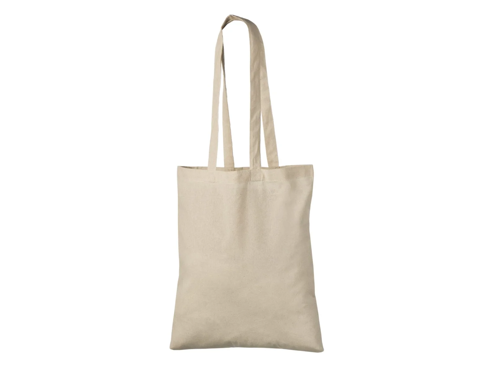
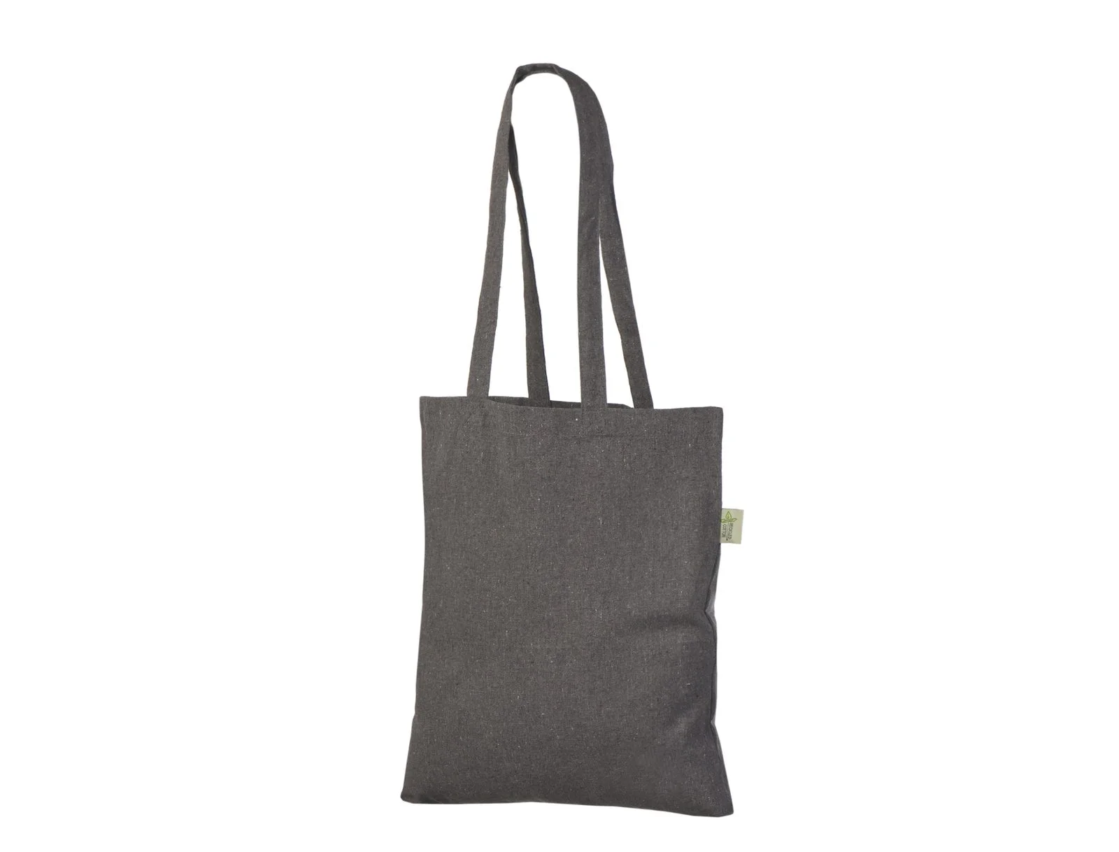
Natural cotton gives the design a light, warm background. Dark grey provides a visibly different setting. Neither should be treated as plain white paper: the underlying fabric is part of the finished appearance.
| Background choice | Check before approval |
|---|---|
| Natural fabric | Does the warm background suit the brand colours? |
| Dark grey fabric | Is the selected print colour clearly visible? |
| Coloured fabric | Does the design remain recognisable against that exact shade? |
Availability depends on the selected model. Confirm the bag colour and fabric weight together rather than assuming every colour is available in every construction.
Separate bag colour from print colour
Changing the bag colour and changing the number of print colours are different decisions. Ask for the same artwork, print position and quantity when comparing two bags. This makes the quotation easier to assess.
Supply a brand colour reference if you have one. Explain whether a pale part of the artwork should be printed or left as exposed fabric. A white-looking area on a screen can otherwise be interpreted in different ways.
Use the mockup to check the combination
A digital mockup is useful for reviewing placement and the overall colour combination. Screen settings and lighting affect what you see, so a mockup is not a physical colour standard. If an exact appearance matters to the project, ask what sample or colour approval options are available.
Frequently asked questions
Must the bag match the logo colour?
No. A contrasting bag can make the logo easier to read. The important question is whether the final combination follows your brand guidelines.
Can a one-colour logo work?
Yes, where the artwork and selected printing process are suitable. Send the approved one-colour version for review rather than simply removing colours from a detailed design.
Compare your colour options
Browse our cotton tote bags and send your preferred colour with your artwork. Request a quote.