
For NEFEL Jewelry, we printed 100 white cotton shoppers in September 2018. The order came through CK Media and used one print colour on one side, with the jewellery brand’s name as the main design.
The photographed bag has a light gold-toned wordmark on a white background. There is no illustration around it, so the shape and spacing of the letters give the print its character.
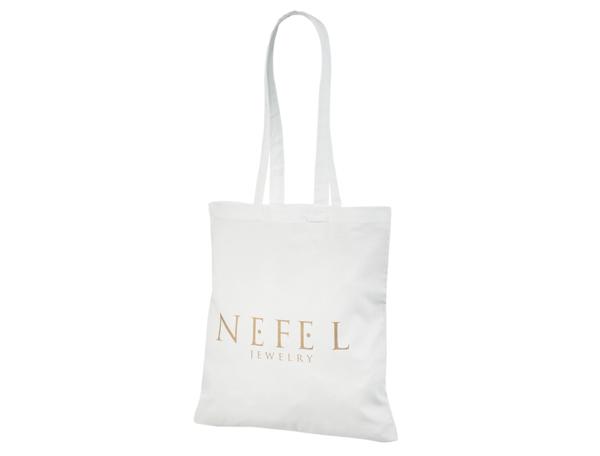
The NEFEL name appears in large, widely spaced capitals. The smaller word JEWELRY sits beneath it, keeping the two parts of the identity together without giving them equal weight.
The fine letterforms create a different impression from a solid block of print. Small details remain part of the design, while the brand name stays central to the layout.
The print has a softer contrast than a black logo would have on the same fabric. Its warm tone gives the lettering definition without adding a dark background or border.
Much of the front remains unprinted. The open area above the wordmark gives the two lines of lettering space of their own.
The cotton shopper has long handles for carrying over the shoulder. Its flat front provides a straightforward surface for the two-line wordmark.
This project shows how a jewellery identity can work on a cotton bag with just one print colour. For your own logo, the white fabric leaves room to choose a similarly light treatment or a stronger contrast.