
In May 2022, we printed 200 orange cotton tote bags for AUTOR, a design and jewellery gallery in Copenhagen. The design brought together two large black shapes and the gallery name on the front of the bag.
The orange fabric gives the print a bright background. A square and a circle sit above the lettering, forming a simple layout with a clear relationship between the symbol and the name.
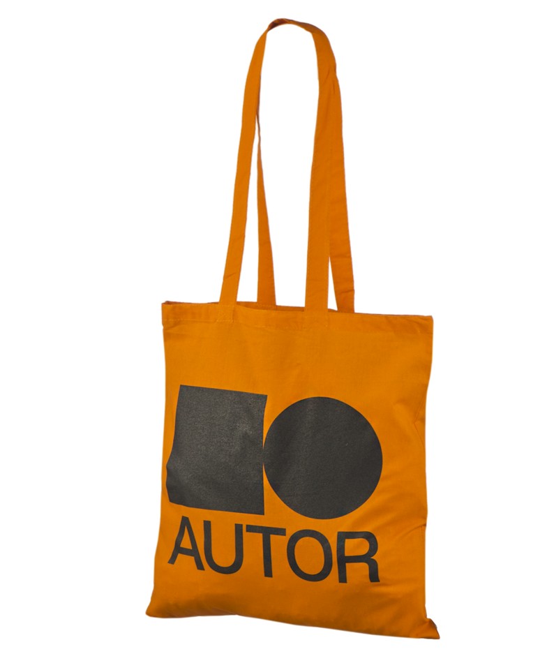
The square and circle occupy most of the printed area. Their solid black surfaces give the design weight, while the different outlines keep the two shapes distinct.
The AUTOR name sits directly below in large letters. The lettering is smaller than the shapes above, so the symbol remains the first part of the design to catch the eye.
The design uses the contrast between dark print and bright fabric. There are no extra printed colours in the photographed artwork; the orange cotton remains visible around the shapes and between the letters.
This example shows how a gallery identity can work with the bag colour. Both are visible parts of the finished design.
The long handles leave the printed front clear and allow the bag to be carried over the shoulder. Unprinted space above the artwork separates the design from the top seam.
For your own gallery bag, an orange cotton background can bring contrast to a simple logo or graphic.