
In June 2019, we printed 100 white cotton tote bags for MeLou, a small craft and design business. The order used a single print colour on one side, with the business name forming the whole design.
The black wordmark sits on the lower part of the bag. Its curved letters and long sweeping strokes give it a distinctive shape, while the white cotton remains visible around and within the lettering.
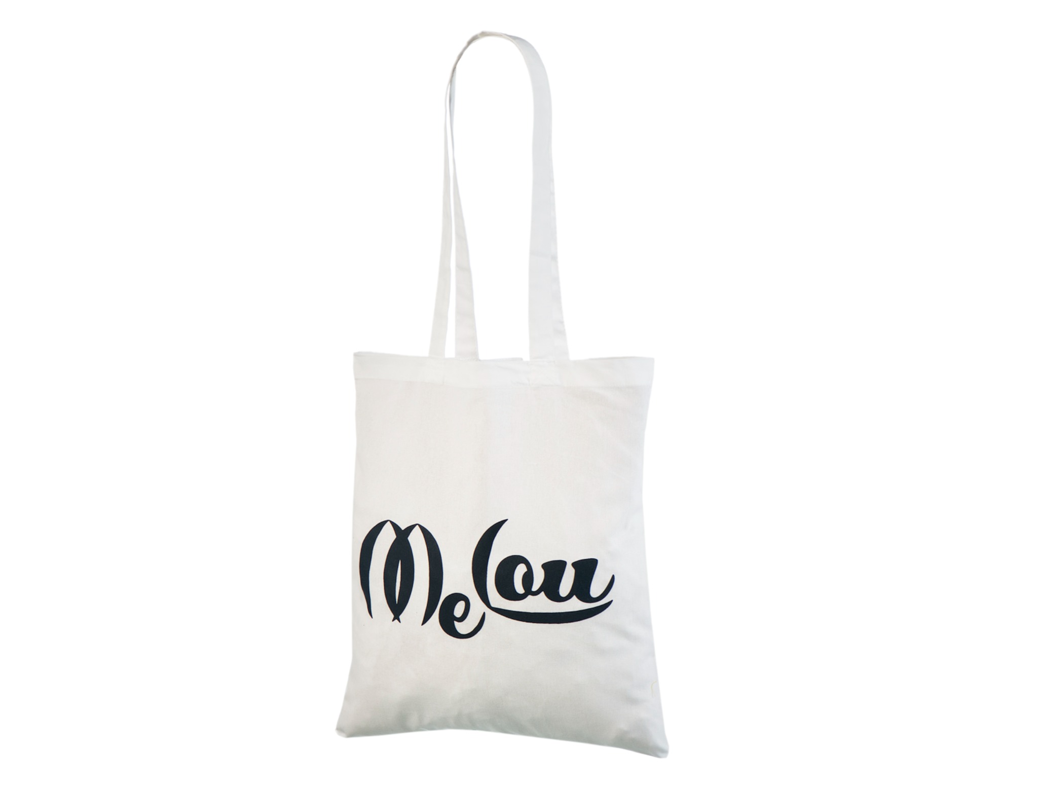
There is no separate illustration or slogan beside the name. The lettering brings its own movement: tall curves on the left are balanced by a broad stroke running beneath the right-hand letters.
This gives the logo a clear outline as a whole. The print is more than a line of standard text, but it still uses only black.
The placement leaves a large area of white fabric between the logo and the top seam. That open space is a visible part of the finished bag.
Keeping other elements out of the layout lets the curved lettering remain the main feature. The wordmark does not need to cover the entire front to give the bag its identity.
The long handles allow shoulder carrying, and the flat cotton body gives the print an uncomplicated background. Black and white keep the relationship between fabric and artwork clear.
For a small business with an existing wordmark, this is a useful example of letting the logo stand on its own.